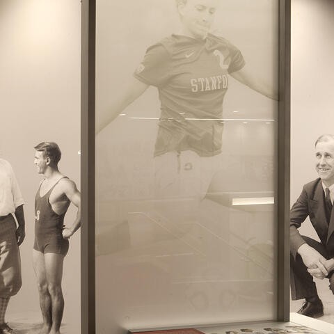


Advent works with pro sports teams, university academics and college athletics brands throughout the US, such as the LA Rams, Stanford University, UNC (just to name drop a few) to bring their brand story to life. If we were high schoolers on a campus tour where Advent has been involved, we’d probably say “that space is lit!” Their work is that good.
Beautiful spaces are only part of the story. This group of creative problem solvers love an opportunity to turn a “what if” dream into a reality that results in a breathtaking “wow.” They are pioneers of experience design, yet humble, friendly and supremely enjoyable to work with. The Advent team asked us to bring our A-game and we enthusiastically rose to the occasion.
With each design element, animation, and effect, we considered what the user would feel and how it contributed to their online experience of the Advent story.
John Roberson, CEO at Advent, said “We believe the world needs more moving experiences.” An inspiring statement that empowered our team to push the creativity and allow the client to decide when to reel it back. We knew the main goal of the website was to create the digital interpretation of a truly moving experience.
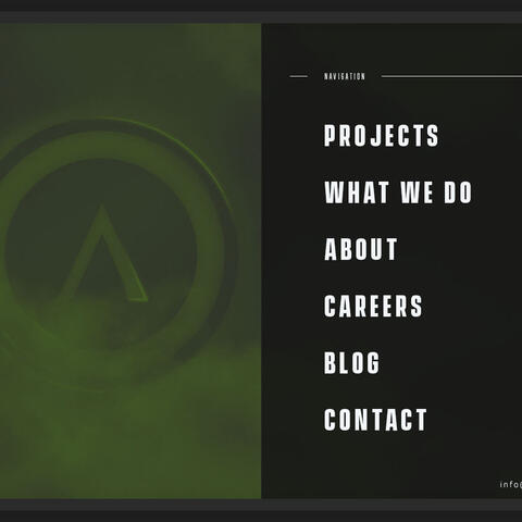
We agreed on a bold design, using a dark background with vibrant color and animations to immediately engage the visitor and invoke a sense that this team is different. Imagery and video focus on recent projects but not just to showcase their completed work. The intention here was to feature the real outcome: the emotional power these spaces had over visitors of all kinds. With each design element, animation, and effect, we considered what the user would feel and how it contributed to their online experience of the Advent story.
The case studies have the ability to do some of the heavy lifting for their sales team, highlighting the full gamut of their problem-solving abilities through design and content.
Each page intended to unfold the Advent story by focusing on the results they’ve created for their clients.
The homepage was designed to explore how Advent approaches their work. They deeply believe in the power of a moving experience –– of creating an elevated, emotional moment between a client and their audience. A bold introduction to their message with a pulse reverberating through the hero section is a digital interpretation of the ripple of emotion. The case study slider provides the first look at the incredible outcomes from their efforts. It’s hard to choose –– do you dig right into the latest project or keep scrolling? If you do decide to peruse further, an emotion-packed background video is overlaid with a defining message about who they are. Finally, some legit testimonials, including videos of very pleased clients in exciting new spaces, provide the social proof you needed to click Contact.
Advent’s new Projects and Case Studies pages were paramount in the success of the website redesign. The case studies have the ability to do some of the heavy lifting for their sales team, highlighting the full gamut of their problem-solving abilities through design and content. Not only did we hope to future-proof their case study pages, we also considered that 200+ past projects with varying content would be repopulated here. We built a highly flexible, modular backend for this part of the site, allowing Advent to have as much or as little of the features appear on the case study page. The icing on this cake? Notice how the color palette matches the client’s brand colors on each case study page. Yeah, we all were giddy over that one.


The mission and mantras at Advent aren’t just for show...they live these ideals in each aspect of their organization. Demonstrating this concept throughout the website is not something we can simply create by pushing pixels. The story was there, the steps documented, the proof captured in images. If you want to tell an authentic and meaningful story, you need to truly make that story the soul of your organization.

