Situation


Their company culture of integrity, compassion and innovation is evident in all they do, and it was time for their online presence to reflect these values.

Ciranda is an innovative bulk organic ingredient supplier, primarily to the food manufacturing industry. They’ve been working with organic products many years before the word “organic” became a mainstream concept. They were founded on the belief that organic is better, but they didn’t stop there. 

The founders at Ciranda are pioneers for Fair-Trade and sustainable practices. They travel around the world to meet their supplies in person, confirming quality, sustainable practices and economic fairness throughout.

Challenge

We had a good laugh when our point of contact at Ciranda mentioned one of our first hurdles: two owners with very different aesthetic preferences will give final sign-off. One is from Brazil, loves bold colors, vibrant energy (he’s been spotted wearing red pants and purple socks to the office). The other prefers white, light, natural, clean design (she created an airy on-site company yoga/meditation studio).

We’re pretty sure they would be fantastic on an episode of House Hunters.

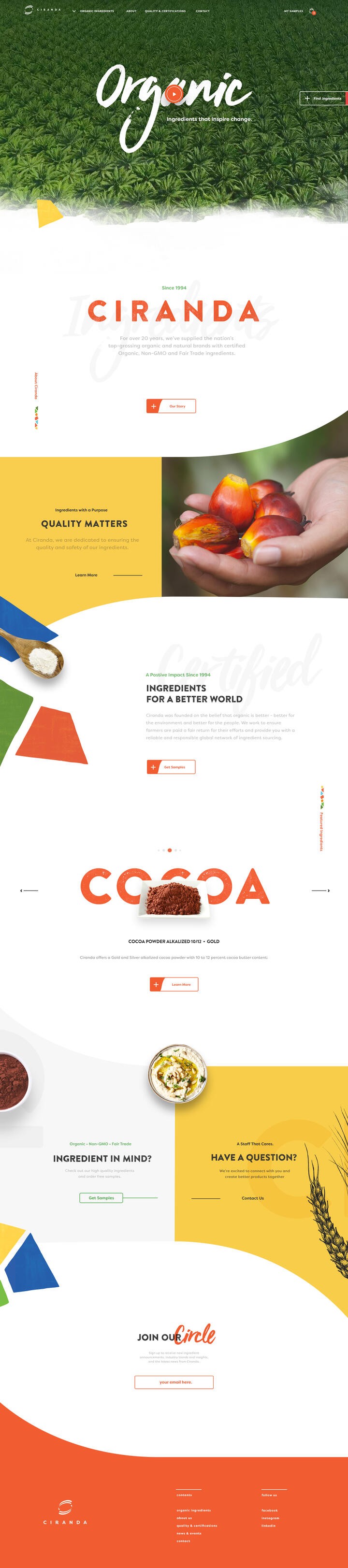
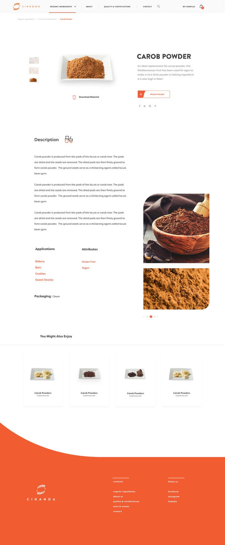
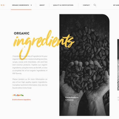
Our teams agreed on a white canvas with pops of brightness throughout, light and elegant animations, and an emphasis on the products and process using prominent imagery. Our intention with the design was to demonstrate Ciranda’s story of quality and fair practices, while balancing two unique aesthetic preferences.

Ciranda Office

Strategy


To work towards the business goal, we focused on the user experience behind product samples. Finding the ingredient had to be easy, with multiple pathways for many types of products.

Build a brand story that creates loyalty and converts visitors to leads.

The website redesign for Ciranda included two main goals. First, the business goal that would help Ciranda continue to grow is by increasing leads via potential clients requesting product samples. The second goal is to clearly demonstrate the Ciranda culture. Ciranda has a strong brand voice and needed to intuitively communicate this online. Their purposeful and ethical approach, proven reliability of their promises and innovation are strengths that we focused on when creating the homepage. Each section introduces and reinforces their brand, building the story for the visitor. A sliding feature section allows Ciranda to share their latest news on the homepage. To work towards the business goal, we focused on the user experience behind product samples. Finding the ingredient had to be easy, with multiple pathways for many types of products. A mega menu with each product was integrated for the user who knew exactly which ingredients they wanted to try. A category page was available for someone who wanted to see all the things available in the coconut product line up, for example. Further, and in-depth ingredient filter allowed the user who needed a specific problem solved (i.e., replace Gluten and must be Non-GMO) but was open to product options helped narrow the search to exactly the items that would help. Finally, an incredibly user-friendly Sample Cart makes the process a snap to complete.

Ciranda homepage
Ciranda Ingredients webpage
Ciranda filter ingredients

Takeaway

Creating a website with soul is a special process. Luckily for us, the people at Ciranda are thoughtful, reflective and worked with us to really get to know their mission and vision. Great collaboration across both our teams helped to get them exactly what they needed to continue to grow.