Discovery Bldg
UW Madison Collegiate Website
Web Design & Development. UX. Content. Strategy.
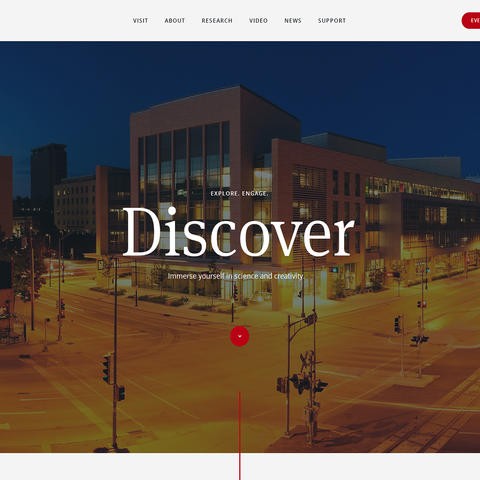
The Discovery Building is a vibrant center at UW-Madison. We created a dynamic and engaging website to match.
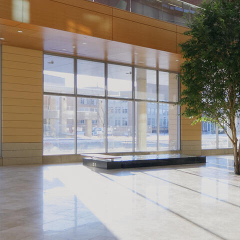
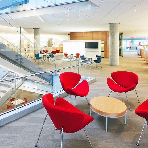
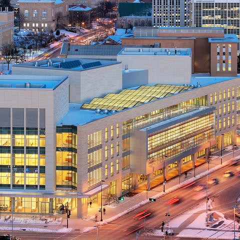
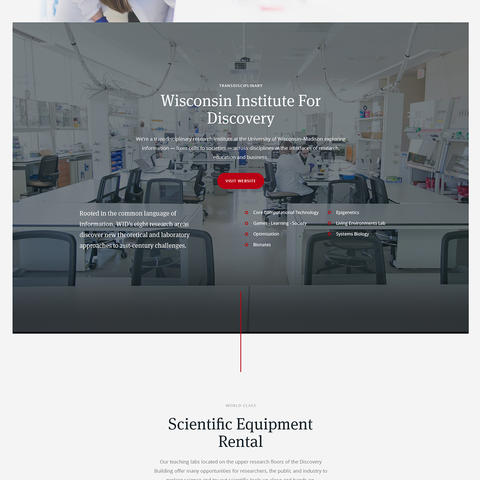
The Discovery Building, the nucleus of research, creativity and exploration at UW-Madison, was experiencing an online identity crisis. The website looked tired, cluttered and confusing, while the building itself was sleek, modern and engaging. The Discovery Building is the LEED-certified home to two world-class research institutes and a main floor dedicated to exploration of science and creativity for the public, campus and researchers.
The energy and excitement of the building is palpable, the research is cutting-edge and the staff and activities are warm and engaging. It was time to align Discovery’s lackluster web presence with its innovative physical presence.
How do we make it easy for the first-time user to understand the Discovery Building through the website?
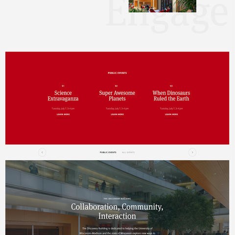
WARF, WID, MIR, Town Center, Wisconsin Institutes for Discovery, Discovery Building. It took a while for the team at Coulee Creative to understand what the various acronyms and entities meant in relation to the building, which brought us to the first problem. The Discovery team leading the project indicated that the number one goal is to increase participation at events for the public and campus.
But before we could go there, we had to make sure that these potential participants understood where they were going, who was involved and ultimately what’s in it for them. How do we make it easy for the first-time user to understand the Discovery Building through the website?
The Discovery Building has many layers and opportunities for involvement, so it was important to unveil these piece by piece as the user scrolls through the site.
Keeping the focus on your target audience is a challenge when you become integrated into an entity, a job, a building.
In any field, it’s all too common to forget that your audience likely doesn’t have the same level of understanding of all your catchphrases and inner workings. Our strategy included learning about the families, community and campus members who would be participating in the multitude of programs and activities offered at the Discovery Building and then maintaining their point of view as our focus throughout the project.
The design and content strategy was created as an unfolding story. The Discovery Building has many layers and opportunities for involvement, so it was important to unveil these piece by piece as the user scrolls through the site. Vivid imagery, strategic use of color, subtle but sophisticated interactions and repetition of the mantra “Explore. Engage. Discover.,” helped support the story Discovery wanted to tell.
The Discovery Building website also had a lot of content, targeted at many different types of users. It was critical to work and rework the navigation, sitemap and content flow in order for the most important information to be easy to find and for the user to feel a natural progression through the website. We created calls-to-action to encourage the user to learn more and feel engaged in the site.
Creating an online experience that aligns with an in-person one requires not only knowing the space, but deeply understanding the people who visit it - what the see, feel, and remember about it after they’ve left.